...my digital hub on the world wide web.

+ my writings and my work.

Refreshing Changes

June 4th, 2010 by lesliefranke

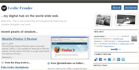
I have launched a new look for the lesliefranke.com. I have been working on this for the past few weeks, and it is still a work in progress, as changes will continue to roll out across the site in the coming days and weeks.

I was happy with the general feel of the previous design I used but it has been several years since any changes have been made. I focused on a few things I wanted to change, hopefully bring increased legibility and usability to the site while opening up the design and letting more space in. In addition, as rest of the cool kids are doing I have added my latest thoughts from twitter to the site as well.

The latest look for lesliefranke.com

Mozilla Firefox 3 Review

June 17th, 2008 by lesliefranke

The third major release of Mozilla’s open-source web browser, Firefox, is now available for download on Mozilla’s website. The new version of Firefox is a major improvement over previous versions of the browser. Significant improvements have been made in performance & security and several useful features have been added in many key parts of the browser including the address bar, bookmark manager, and download manager.

The User Interface

Default Theme

One of the first things you will notice when using Firefox 3 is the redesigned interface. One of the main goals for Firefox 3 was to better integrate the browser with each computer platform in order to make Firefox feel more natural. Thus, there are now four different default themes for Firefox 3. One each for Linux, Mac OS X, Windows XP, and Windows Vista. The biggest change is to the design of the back and forward buttons on the browser tool bar. The new interface combines the two buttons into a single composite button shaped like a keyhole. The back button is the larger portion of the keyhole. The forward button is smaller and to the right of the back button, and a dropdown menu to the right of the forward button lets users view all the pages they have browsed in the current session with the page they are currently on shown in bold type.

Location Bar

In Firefox 3 the Location bar has been completely revamped. The new Smart Location Bar, “AwesomeBar”, allows the URL field in Firefox to be used for keyword searches of its bookmarks and history. The Smart Location Bar will match what is typed in against page titles, URLs, and tags in the browser’s bookmarks and history to return a list of results that show a page’s favicons, title, and URL which you can then choose from. Searches are instantaneous and happen as you type.

Add-on Manager

In Firefox 3 the Add-on manager has been expanded to include a new “Get Add-ons” tab where you can view recommended add-ons, search for new add-ons, and install add-ons with a simple click. The Add-ons manager is now fully integrated with the addons.mozilla.org website. The revamped Add-ons manager is also used to work with any plugins that are installed. As with add-ons in Firefox 3, if a plugin is found to contain a security vulnerability, Firefox will automatically disable it and show where to get an updated version.

Download Manager

The Download manager has received several improvements in Firefox 3. It now includes the ability to pause and resume downloads, both manually and automatically. Other changes include a download status indicator in status bar and the ability to search through files that have been downloaded in the Download manager.

Password Manager

Instead of the password dialog box, Firefox 3 presents the option to store a given password using an information bar that slides down from the top of the browser after the user has logged in. In addition, this information bar is non-modal so you can continue using the browser without being forced to dismiss the message first.

Tabs

Smooth scrolling between tabs has been added to Firefox 3. When you scrolled your tab bar in Firefox 2, the tabs moved back and forth a full tab at a time. Opening a group of tabs now appends them to existing tabs and when shutting down Firefox 3 asks if the user wants to save the open tabs and windows.

Zooming

Page zoom in Firefox 3 now includes both full page and text only zoom. Full page zoom scales the page layout and structure while allowing for complete control over the size of the displayed content. A extremely useful feature of page zoom is that Firefox now automatically remembers the zoom level that is set on a site basis. Text only zoom, operates as before by only zooming the text on a page, leaving the images and page layout untouched.

Bookmarks and History

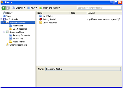
A major change in Firefox 3 is how bookmarks and history are handled. The new version of the browser introduces ‘Library’, a single window to organize the browser’s bookmarks and history. Firefox 3 introduces three main features: bookmark starts, tags, and ‘smart folders’.

Bookmark stars are designed as a quick and easy way to bookmark a page with a single click. One click on the star icon at the end of the location bar will allow you to bookmark a site. Double clicking on the star icon will allow you to choose where to save it and whether to tag the bookmark or not.

Bookmark tags are a way to add information to a bookmark, allowing you to organize them in a much more flexible manner than old-style Folders would allow (think del.icio.us). Smart folders are “saved searches” that automatically update when you add new items matching that search to your bookmarks.

Firefox 3 has made browser history more useful also. Besides being a major source of information for the Smart Location Bar, History now stores sites’ favicons along with the other location data to make scanning and identifying history entries much easier.
Offline Capabilities

Among the major new features in Firefox 3 are its offline capabilities and its ability to seamlessly interact with Web-based applications and services. The new version of the browser makes it possible for sites to deliver applications that people can use even when they are not connected to the Internet allowing these sites to work with a browser in much the same way that traditional applications work with an operating system.

Security

Ensuring that users are safe and protected on the Web is one of the biggest challenges a browser maker faces. Firefox 3 attempts to keep users away from bad sites by giving them information to help make a decision about the validity of a website. A user is now warned when visiting a site known for serving malware and will have to whitelist a to access it. In addition to the malware protection, Firefox 3 also has improved phishing protection. Reported phishing sites are now blocked up front, before the page is even loaded.

Firefox 3 also introduces a new security feature known as the Site Identification button. This button replaces the padlock icon and attempts to determine as much as it can about the site. It makes this information easily accessible through a button at the left end of the location bar. This button (gray by default) turns blue for encrypted connections (SSL) and green for sites using EV certificates (think eBay or PayPal).

Speed and Performance

Behind the curtains the Mozilla developer team have worked hard to improve the speed, memory usage and reliability of the browser. Firefox 3′s memory footprint has been dramatically reduced. One of the biggest issues with previous versions of Firefox was its performance record. Firefox 3 is the fastest, slimmest version of Firefox yet. Speed tests are showing a 2 to 4 times improvement over Firefox 2 and memory usage tests show that Firefox 3 is 2 times more efficient than Firefox 2.

Conclusion

Mozilla Firefox 3 is a significant improvement over Firefox 2. Overall, the browsing experience feels better. The decreased resource consumption, better security, and little details in areas such as bookmarking and the location bar show that Mozilla took a step in the right direction with the latest version of the Firefox browser. With this release Mozilla Firefox 3 is the fastest and most feature rich Web browser available on any platform.
Palm Centro Smartphone

October 19th, 2007 by lesliefranke

Recently Palm debuted the Palm Centro smartphone, their first new handheld line in some time. The Centro is being positioned as a cellphone for those who are looking to upgrade from a basic phone to one with a more functionality such as email, instant messaging, and web browsing and has generally been receiving good reviews. The Centro comes with a full QWERTY thumbboard, a 320 x 320 touchscreen, and a camera that can shoot photos and video. For the first ninety days, it is available only through Sprint and will cost $99.99 with a new contract.

Palm Centro

For some time now Palm has been struggling to regain its footing in the marketplace. The Centro may be the boost Palm desperately needs depending on the expectation of users. Herein lies the problem. The Centro is designed to appeal to a young audience, one that wants a phone with personality and style and says something about who they are. The trouble is that there is nothing revolutionary about the Centro. It’s basically a shinier and slimmed down Treo, nothing earth shattering. The Centro’s main selling point is about a price breakthrough not a technology one.

Marketing aside, the Centro is the direction Palm should be headed. It is good to see Palm going aggressively after the lower end of the marketplace. What works in Palm’s favor (but could also be their downfall) is that the Palm OS is more stable than almost anything on the market today making it a great candidate on a device for the masses. This makes Palm “exclusivity” deal for 3 months with Sprint a head scratcher. They are narrowing down their range of potential customers who can purchase their product at the same time they desperately need the masses to buy into their latest offering.

I wish Palm all the best. I have used a Palm device of some sort for some time now and would be saddened to see them become a niche player in the marketplace. Unless Palm can get their house in order with a new version of the Palm OS software, though, their options are disappearing to more innovative and nimble competitors. The Centro may not be enough of an advance to prevent this from happening but it is a good start.

Palm Cancels the Foleo

September 5th, 2007 by lesliefranke

A few months after being introduced, Palm has made the decision to kill its first generation Palm Foleo. The idea behind the Foleo was that it would connect wirelessly to your mobile device, thus allowing large screen viewing and typing as needed. Many analysts have derided the product as disappointing, though, and with a large amount of software related bug fixes threating to delay the launch of the Foleo, Palm CEO Ed Colligan has decided to cancel the entire project instead.

From the entry in The Official Palm Blog:

In the course of the past several months, it has become clear that the right path for Palm is to offer a single, consistent user experience around this new platform design and a single focus for our platform development efforts. To that end, and after careful deliberation, I have decided to cancel the Foleo mobile companion product in its current configuration and focus all of our energies on delivering out next generation platform and the first smartphones that will bring this platform to market. We will, of course, continue to develop products in partnership with Microsoft on the Windows Mobile platform, but from our internal platform development perspective, we will focus on only one.

The cost of the decision to Palm will be significant, and includes a charge against earnings of “less than $10 million,” according to Palm. What stands out to me from this announcement, and which was also pointed out by Michael Mace, is that Palm has been working on multiple versions of Linux, one to run future Treos and one to power the Foleo. It would seem that this was the decision that doomed the Foleo. The Foleo was never economically feasable in the long-run. It was too much of a niche product to support the costs of maintaining multiple platforms.

It’s been a tough time lately for Palm fans as they have watched the company stop innovating and be passed by in the marketplace by their competitors. At one time, what differentiated Palm devices from handhelds which ran other operating systems, was their ease of use and form factor. They did everything they were designed to do simply and quickly. Hopefully, the cancellation of the Foleo will allow Palm to refocus its attention on building of a better platform for the Treo or maybe even building a new standalone handheld such as a next generation TX or T3.

Shades of Gray for WordPress Sandbox

August 5th, 2007 by lesliefranke

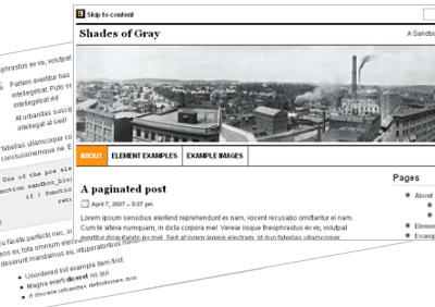
Shades of Gray is not a theme for WordPress itself, but a skin for the WordPress Sandbox theme. Shades of Gray is a minimalist, two column fluid-width theme. It is primarily a grayscale skin but could easily be modified to use whatever colors you desired. If you would like to play around with the skin in the wild feel free to download it and give it a try.

Shades of Gray WordPress Sandbox Skin

Installing Shades of Gray is simple. Just follow the steps below.

1. Upload the sandbox-shadesofgray folder to your Sandbox folder in the wp-content/themes/ on your server.

2. Edit the default Sandbox style.css file, so that it loads the Shades of Gray skin. You can do this by replacing current @import url… line with this one:

@import url(’sandbox-Shades of Gray/style.css’);

Download the skin from the Sandbox Design page.

Note that you must have Sandbox installed to use Shades of Gray, if you don’t have Sandbox you can get it here.

Modifying Shades of Gray

Feel free to modify Shades of Gray in any way you like. To make the skin your own you should replace the icon in the top left corner of the screen and the panoramic image spreading across the top of the page with images of your own. In addition, the Shades of Gray skin includes numerous print styles to format the page for printing and is also designed to format a WordPress category named ‘Asides’ differently than other categories. Either one of these can be changed or removed entirely. More details on how to to this is in the readme file in the download.

License & Credits

Shades of Gray is released under the GNU General Public License, meaning you can do pretty much whatever you want with it, but a link back to lesliefranke.com is always appreciated. Of special note some of the icons in Shades of Gray have been adapted from the “Mini” (http://www.famfamfam.com/lab/icons/mini/) icon collection by Mark James and the Feed Icons are from http://www.feedicons.com/.

Who Am I?

Leslie Franke Profile

Leslie Franke:[les-lee fran-key]; 1. Husband and proud dogowner; 2. Seventh-day Adventist; 3. Web Designer; 4. Atlanta Braves Fan; 5. Northeast Ohio Native; 6. Bottle Caps Lover; 7. Certified 'Freakonomic';